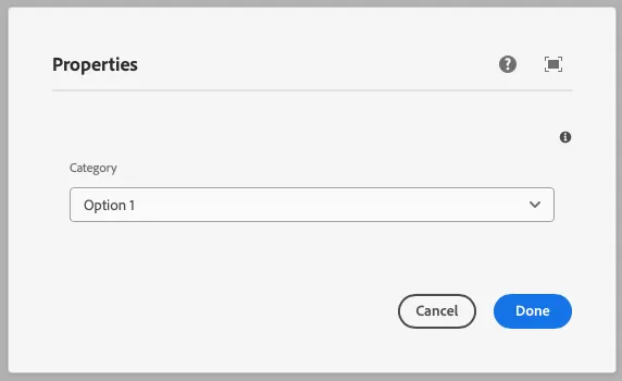
Select
This component generates a select field to be used in the author dialog. The select field’s value is passed to the component as a prop.
Properties
Section titled “Properties”| Property | Type | Description | Default Value | Required |
|---|---|---|---|---|
label |
string |
The label of the select component | Yes | |
placeholder |
string |
Placeholder text for the select field | No | |
tooltip |
string |
Tooltip text for the select field | No | |
values |
array |
Array of options for the select field | Yes | |
defaultValue |
string |
Default value for the select component | No | |
multiple |
boolean |
Allows multiple selections | false |
No |
Example
Section titled “Example”To use a select component in the author dialog, we can use the following code:
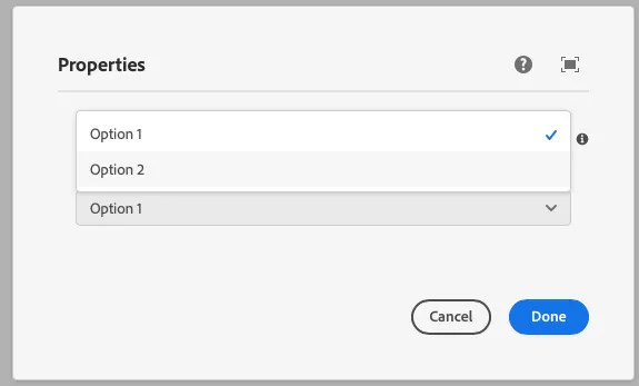
{ category: select({ label: 'Category', placeholder: 'Select a category', tooltip: 'The category of the component', values: [ { value: 'option1', label: 'Option 1' }, { value: 'option2', label: 'Option 2' }, ], defaultValue: 'option1', multiple: false, })}Example in author dialog
Section titled “Example in author dialog”