Media
This component generates a media field to be used in the author dialog. The media field’s value is passed to the component as a prop.
Properties
Section titled “Properties”| Property | Type | Description | Default Value | Required |
|---|---|---|---|---|
label |
string |
The label of the media component | Yes | |
tooltip |
string |
Tooltip text for the media field | No | |
defaultValue |
string |
Default value for the media component | No | |
allowedMimeTypes |
array |
Array of allowed MIME types for the media field | No |
Output Type
Section titled “Output Type”type MediaOutputType = { alt: string; url: string; renditions: string[];};Example
Section titled “Example”To use a media component in the author dialog, we can use the following code:
{ media: media({ label: 'Media', tooltip: 'The media of the component', allowedMimeTypes: ['image/jpeg', 'image/png', 'video/mp4'], })}Example in author dialog
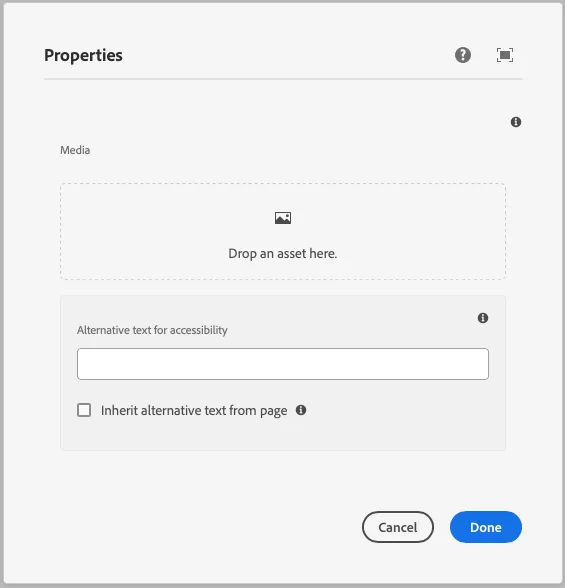
Section titled “Example in author dialog”