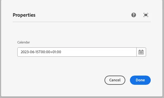
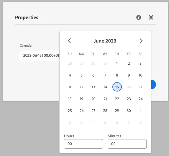
Calendar
This component generates a calendar field to be used in the author dialog. The calendar field’s value is passed to the component as a prop.
Properties
Section titled “Properties”| Property | Type | Description | Default Value | Required |
|---|---|---|---|---|
label |
string |
The label of the calendar component | Yes | |
placeholder |
string |
Placeholder text for the calendar field | No | |
valueformat |
string |
Format of the value returned by the calendar | Yes | |
displayformat |
string |
Format of the date displayed in the calendar | Yes | |
headerformat |
string |
Format of the header displayed in the calendar | Yes | |
startday |
string |
The start day of the week | No | |
min |
string |
Minimum date that can be selected | No | |
max |
string |
Maximum date that can be selected | No | |
defaultValue |
string |
Default value for the calendar component | No |
Example
Section titled “Example”To use a calendar component in the author dialog, we can use the following code:
{ calendar: calendar({ label: 'Calendar', placeholder: 'Select a date', valueformat: 'YYYY-MM-DD', displayformat: 'MM/DD/YYYY', headerformat: 'MMMM YYYY', startday: '0', min: '2023-01-01', max: '2023-12-31', defaultValue: '2023-06-15', })}Output Type
Section titled “Output Type”type CalendarOutputType = string;Example in author dialog
Section titled “Example in author dialog”