Navigation
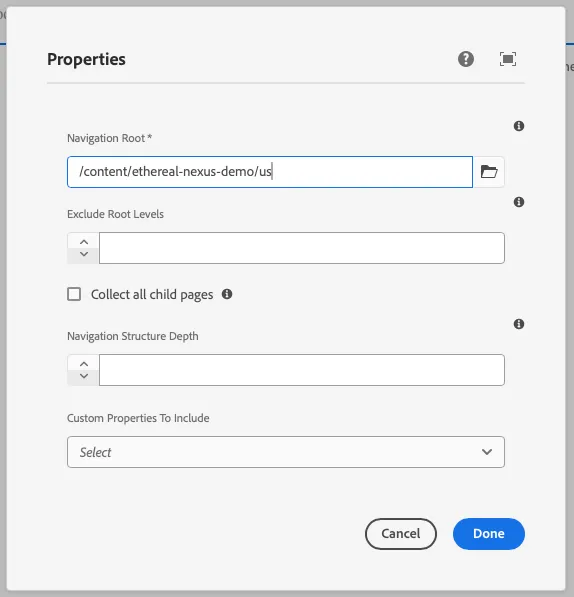
This component generates a navigation field to be used in the author dialog. It lists a tree of pages so that users of a site can easily navigate the site structure. The navigation field’s value is passed to the component as a prop.
Properties
Section titled “Properties”| Property | Type | Description | Default Value | Required |
|---|---|---|---|---|
label | string | The label of the navigation component | Yes | |
placeholder | string | Placeholder text for the navigation field | No | |
showChildrenCheckbox | boolean | Whether to show a checkbox for child items | false | No |
showRootLevel | boolean | Whether to show the root level | false | No |
defaultValue | string | Default value for the navigation component | No | |
pageProperties | array | Array of page properties | No | |
tooltip | string | Tooltip text for the navigation field | No | |
required | boolean | Whether the navigation field is required | false | No |
Example
Section titled “Example”To use a navigation component in the author dialog, we can use the following code:
{ navigation: navigation({ label: 'Navigation Root', placeholder: 'Select a navigation root', showChildrenCheckbox: true, showRootLevel: true, pageProperties: [{ label: "subtitle", value: "subtitle", }], tooltip: 'The root page from which to build the navigation. Can be a blueprint master, language master or regular page.', required: true, })}Output Type
Section titled “Output Type”export interface NavigationItemSchema { id: string; children: NavigationItemSchema[]; active: boolean; url: string; title: string;}Example in author dialog
Section titled “Example in author dialog”