Group
This component generates a group field to be used in the author dialog. It groups multiple fields together for better organization. The group field’s value is passed to the component as a prop object.
Properties
Section titled “Properties”| Property | Type | Description | Default Value | Required |
|---|---|---|---|---|
label | string | The label of the group component | Yes | |
children | object | The children item schema | Yes | |
tooltip | string | Tooltip text for the group field | No | |
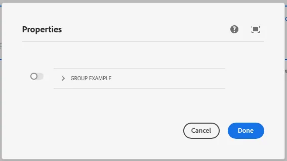
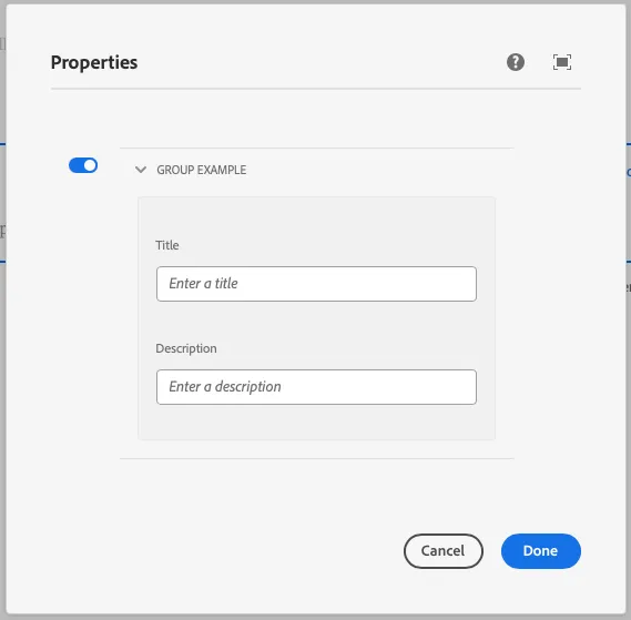
toggle | boolean | Whether to show a toggle for the group | false | No |
Example
Section titled “Example”To use a group component in the author dialog, we can use the following code:
{ group: group({ label: 'Group Example', toggle: true, children: object({ title: text({ label: 'Title', placeholder: 'Enter a title', }), description: text({ label: 'Description', placeholder: 'Enter a description', }), }), });}Example in author dialog
Section titled “Example in author dialog”